Tuesday, 11 January 2011

Post 17 Ancillary Task 2 - Film Reviews Part 1

As well as the postcard another individual task we have to complete is a film review. In order for us to create a well designed and written film review it was vital that before we do so we looked at a few examples.

In class we looked at the film industry magazine Sight & Sound. Although we will be writing a film review on our short film "Synchronicity", Sight & Sound focuses on more long feature films. But it was still a great example to get ideas and apply them to our own short film review. The film review that we read over and used as an example was a film called Frozen. Frozen was a film released in 2004 and was directed by Juliet Mckeon. Juliet Mckeon went on to feature films after previous success with short films.

Posted below is the film review on the film Frozen we were looking at:


Reading it through we broke the film review article down paragraph by paragraph and in groups we talked about the key points and conventions the film review had.

- We started with the overall layout of the film review. We noted that it had a clear synopsis of the film and was layed out into paragraphs with the key information about the film posted at the top. The article also had a picture of the main actor to give the review some visual context.

- It also talked about the casting and how good the actors were. one of the main points that it said about the actors was that the overall storyline was not the best butt the casting allowed it to be a enjoyable watch and talk about how Shirley Henderson brought it around. 

- Also the film review used exciting phrases and words in order to attract to the reader to want to carry on reading it. such as "magical, impassive and cinematic". 

- Also it compares Frozen to other films.

After we had read Frozen and analysed it we was set some independant study to go off and read some other short film reviews to get ideas to help us with ours.

I looked at two different film reviews on The Kings Speech which is a British Film tipped to be big this year. I read through The Guardian's interpretation of the film and then The Independants.

The Guardian:


The Guardian differs hugley to Sight & Sound. This is because The Guardian is a newspaper. Therefore readers of The Guardian would not only be reading The Guardian for film reviews but also for general news and devlopments in there everyday life. Where as Sight & Sound is a formal film magazine so therefore readers to this magazine will only be intrested in reading it for reading about film reviews. When reading through the film review there was a clear diffrence in language between the two different styles of reviews.

Overall I found The Guardian's review of the Kings Speech written by Peter Bradshaw a very enjoyable read. I feel that this it the type of film review that I would prefer to read as when I read the Sight & Sound one of Frozen the language was a lot harder to understand. 

Below I have pointed out some of the key coneventions and points about the film review:

- The overall layout of the review allows it to be very visual and easy on the eye for the reader. You have a picture for good visuals. It also has a information about the film half way down on the left giving information about the film certificate, running time, cast and director. This I feel is very interesting as it gives readers the key information they need about The Kings Speech.

- The Guardians review of The Kings Speech also keeps readers entertained throughout with comical phrases and words. Example being "and who pronounces the word "promise" as "plwomise"

- It also talks about the main cast and how fantastic they are, along with supporting cast and how they gave a crucial supporting role

- Peter Bradshaw also talks about the main storyline throughout The Kings Speech this gives readers a burning edge to want to watch The Kings Speech. This is one role a film review is crucial to supporting a film.  


The Independent 


The Independent's film review on The Kings Speech was written by Nicholas Barber. Comparing it to The Guardians review it was a lot less heavier to the reader. This is because the film review was a lot less in formal. Using more common language and slang for the less educated reader. 

Below I have pointed out some of the key coneventions and points about the film review:

- It gives the film great reviews and speaks about The Kings Speech is in encouraging manner. It begins by saying The Kings Speech is a definite for UK's best hopes of an Oscar. This gives it a powerful opening to the review as it talks about it positively straight away.  

- Similar to most other film reviews it has a picture of the main actor. This gives readers good comfort with visuals as they can familiarise there selves to the actors before going to watch the film.  


Post 16: Ancillary Task 1 - Postcards

One of our independant tasks during making our short film is to create a postcard for our short film. A film poster is usually used to advitise big budget films but in our case a postcard would be more suittable. This is because it is easier to distribute the short film.

Although we are not creating a film poster we are still required to know about the key conventions of them. So in class our first task was to write down a list of things we would expect to find on a film poster.

Below I have listed what I would expect to find on a film poster:

-  Name of the Film
-  A picture from the main characters or something to symbolise the main point of the film
-  A Slogan or tagline to catch the atention of people
-  A short stynopsis of the film
-  Name of the production company
-  Name of the director
-  Release dates for the film
-  Actors/ Actresses names

In order for us to get to grips with film posters I decided to independently study a few examples of some. I decided to look at one example from a Hollywood film and then one from a British film to see if there is any differences between the two and whether a film budget can have any influence on how a film poster looks.

Due Date Film Poster:
(Hollywood)


The first film poster I looked at was from the 2010 big hit film from Hollywood "Due Date". Due Date was made on a budget of $65 million. Therefore "Due Date" would have no trouble distributing there film posters to a wide audience across many different location as they would be able to make the profits back up in the cinemas. Also Due Date has well known actors that can cross the audiences and the director of Due Date also made one of the most popular films in recent times The Hangover. This is why big budget Hollywood films can have the ability to make well designed and distributed film posters.

The Conventions of the film poster are clear. It is a good visual film poster in my opinion because a nice clear big picture covering the whole poster of the two main characters. It shows them to be looking rough and looking like they have gone through a lot. This straight away gives the audience a sense of wanting to watch the film as they will be eager to find out why they are like that. It also has the names of the two main characters at the top. This will comfort audiences if they know who the actors are and will help them to getting to the cinema to watch the film. It also has the name of the film in big capital letters at the bottom of the page with other films that the director of Due Date has created above it and then the release date beneath it. It is also very colourful and catches your attention

Lock Stock & Two Smoking Barrels Poster:
(British)


The British film poster I looked at was Lock stock & Two Smoking Barrels. Comparing this to Due Date, Lock Stock will be harder to cross to a wide audience as it was the first film to be made therefore not a lot of people would no much about it. Also it was made on a lot smaller budget to Due Date so therefore would not be able to produce as many film posters and distribute to as many locations.

The conventions of the film poster also differ to the Due Date one. For a start there is a lot less colour on the Lock Stock poster. This may be  because it is more expensive to produce as many film posters with big graphics on them like the Due Date one as Lock Stock is made with a smaller budget. Or they are trying to create a dark eerie gangsta effect through black and white. You have a main picture of Vinnie Jones the main actor in the film being the dominant thing on the poster holding guns. This will straight away give away that this film is full of fast paced action. The title is in large lettering in the centre of the poster catching the audiences attention. It also has a review on the top left saying "This years best British movie" This will help the film get more viewings at the cinema as people will be eager to see if it lives up to its review.

Postcards:


After we had understood about film posters and why they are produced and what inflicts them. We started looking at postcards and analysing them. We looked at a few examples of postcards from short films produced by Becky Knapp who helped us with our script.

Divine


From this postcard on the short film called Divine you can see that there is a main image dominating the whole  main side of the postcard. This straight away draws the audience into it. It has the name of the short film at the top in white lettering and this goes well with the black background as it creates a sense of eeriness and engages the audience. It also has a slogan saying "Let's go to church" this is also engaging the audience as it adds to the eeriness. On the back is all the information about the director, cast, costume designer, edited and sound by and an e-mail address about any further queries.


On A Life's Edge


The postcard for On a Life's Edge differs in many different ways to the postcard for Divine. The front side of the postcard is actually quite similar to Divines one with a main picture dominating the front side. But differs as it has three more images up the left hand side of different filming locations. It also has the name of the film at the bottom. On the back it is completely different to Divines design.  It has less information including a synopsis, the casting, directed by and produced by.


My Designs  

Posted below are my postcard designs:


Post 15: Reflecting On Theory

In previous posts I have talked about three different theories. These were Genre Theory, Narrative Theory and Audience Theory. In this posts I will be reflecting on these theories and applying them to the short film that I am making. This post is also important as it prepares us for our exam in the summer.

The first theory we looked at was Genre Theory in Post 4. We looked at Robert Altman's, Neales and Hartleys views and opinions on Genre Theory.

Robert Altman believed that "Genre are defined by producers and are easily recognised by audiences. Applying this to my short film. It is key for our audience to know what genre my short film is as throughout previous posts I have talked about how important it is for audiences to understand what genre a short film is.

Ways in which we could relate to Altman's views in our short film is with our set design and lighting. For example my short film Synchronicity is a Drama film. So for audiences to understand the genre of our short film easier we need to make sure we show a drama film. With changing the atmosphere in the lighting audiences could relate to the drama that is going on in the film.

Tuesday, 7 December 2010

Post 14: Pre-production Documentation

-Posted below are all of our pre-production documents. It was vital we got the process of pre-production done to prepare our self properly for filming. In our production group the name of our short film is "Synchronicity". The script was created by our director Anton.

This is our final script:


We each separated ourselves into a different department to help ease the flow of work. After we each all researched all the departments in post 10: http://ryanthrussell-a2-ms.blogspot.com/2010/11/post-10-job-roles-research.html  We each decided on a role that we would be suited to in the group. I decided to take up the role of Lighting and Sound.

The pre-production jobs I have to complete for the role of  Lighting and Sound are:
-  Technical Reccee
-  Lighting Plans
-  Lighting Equipment
-  Sound Equipment

I had to create the lighting plans of our filming location so I created a blue print of each location we are going to film in. I decided to do them from a birds eye view. Included in the blue prints I had to locate the main objects in the room like sofa's, tables, shelving etc. I also had to indicate on them the natural lighting and artificial lighting sources. So for natural I showed where all the main lighting sources come from. So I drew on where the windows are in each location. For artificial I located lamps, lights and spotlights.

For each blue print of each scene I also had to write a plan of whether we needed any extra lighting or effects. Such as an 85 filter to make our scenes and location look warmer or any blue gel to naturalise the filming environment.

Posted below are my Lighting plans:


In scene 2 we will be using 1/4 blue gel to put over the spotlights. We are using this to try and decrease the orange effect being created with the natural lighting coming through both windows when mixing artificial lighting with the spotlights. The 85 filter will be used to block out most of the natural lighting and allow the room to have a much clearer and warmer effect. We will also be using a full diffuser and pro light.


For scene 3 we will blue gel to put over the spotlights to get rid of the orange effect which will occur. We will also have a lamp on the desk to create a more office like atmosphere, the 85 will then be used to put over the camera to warm up the atmosphere. 


For scene 4 we will be using 1/4 blue gels to put over the spotlights. We are using this to try and decrease the orange effect being created with the natural lighting coming through both windows then mixing the artificial lighting with the spotlights. We will also be using an 85 filter with the spotlights, which will be used to block out most of the natural lighting and allow the room to have a much clearer and warmer look. A diffuser and pro light will also be used during this scene.


In scene 5 we will also be using a 3/4 blue gel which will be placed over the spotlights. This will decrease the orange effect in which we don't want this to happen, an 85 filter will also be used to be placed over the camera, to block out most of the natural lighting and give a much warmer look to the atmosphere. Again, a full diffuser, and pro light will also be used. 

In scene 6 we will also have a blue gel placed over the camera, which will tone down the orange effect caused by natural and artificial lighting. A desk lamp will also be used to create an office like feel to the scene. The 85 will then heat up the room and create a warmer tone to the scene.


For scene seven we will be using the same lighting with every other living room but with ½ blue gels over the spotlights.


For scene eight we will be using the same lighting with every other living room but with ½ blue gels over the spotlights.


For scene nine we will be using blue gel to put over the spotlights to get rid of the orange effect caused. We would also have the lamp on the desk on to create a more office like feel. We would then have the 85 to heat up the room.


For scene ten we will be using the same lighting with every other living room but with full blue gels over the spotlights.


For scene eleven we will be using blue gel to put over the spotlights to get rid of the orange effect caused. We would also have the lamp on the desk on to create a more office like feel. We would then have the 85 to heat up the room.


For scene twelve we will be using the same lighting with every other living room but with full blue gels over the spotlights.


As I will be using the sound equipment as well as planning all the lighting it is vital that I know how to work and set up the microphone to use during our filming. With this in mind me and two other members of the other two production groups in our class made a short video of how to connect and set up the sound equipment.

Our videos are posted below:


Nicola took up the role of being our set designer. We identified the pre-production jobs our set designer would have to complete. They are listed below:

- Researching
- Location Reccee (With camera man)
- Technical Reccee (With Lighting & Sound)
- Mise-en-Scene
- Mood Boards
- Props
- Make up
- Set Design

Costumes

Our set designers job was to create and design the costumes  for our characters. She had to create 3 different styles. One for our 11 year old girl Isabel, the other for our women lawyer Lisa and the third for the male lawyer Simon.

These are the costumes that she created for our characters:

Isabel:


This is the costume design for Isabel. Nicola wanted Isabel's costume to reflect today's modern youth society but also something suitable for her age and can reflect the wealth of her parents as lawyers. Isabel will be wearing a short sleeve top, skirt & leggings with dolly shoes. This outfit will demonstrate the youth with leggings which many youth where nowadays. The dolly shoes will also represent Isabel's youth.


Simon:


This is the costume design for Simon. Simon is a hard working lawyer and is a dominant character throughout Synchronicity. As in the film Simon is just returning home from work he will be dressed in business dress. So he will be smart and in a suit and tie, with black smart shoes. Simon is also quite a stressed person so this will be reflected in his costume. His shirt top button will be undone and his tie will be loosened to show he is stressed and tired and in need of a rest.


Lisa:


This is the costume design for Lisa. Lisa like Simon is a well respected business woman. So Nicola wanted Lisa to be dressed smartly as if she has just had a day at the office. But also just like Simon, Lisa will be returning home after a long day at work in need of a rest. So therefore Lisa will be a suit of a jacket and smart skirt with a shirt. In some scenes it will show Lisa without her suit jacket on and her shirt un-tucked to show her looking tired and in need of a rest and relaxation.


Mood Boards

Another task for our set designer was to create mood boards for each of our characters costumes. Nicola started with creating a collage of suits of male and women lawyers to help for her costume design for Lisa and Simon. Nicola got a selection of different suits together so she could decided on the perfect suit for Simon and Lisa. In the end she went for a pin striped suit for Simon and a blazer and skirt for Lisa. 

Here is the mood board for Simon & Lisa's Character costumes:


For Isabels mood board Nicola did a similar thing with gathering loads of images together of young girls fashion. Nicola saw a common trend in leggings and long top when ever she researched young fashion. With this in mind Nicola decided to go for this look with Isabel.

Isabels mood board can be seen below:


Character Profiles

Nicola also had to create character profiles for each of our characters and state what they look like and what there character personalities are like.

Isabels character is quite an isolated one. As she is ignored by her parents for most of the time who are to interested in there case and have no time for her. Isabel is always wanting to play but keeps getting pushed away by the parents. Which then forces her to become isolated and begging for attention.  

Isabels character profile can be seen below:


Simon is a powerful character. His money and wealth and job as a lawyer allow him to be powerful. In the film his dominace and wealth show him off to be a negative character as he ignores Isabel and focuses more on his job.

Simons character profile can be seen below:


Lisa is similar to Simon as she is also a lawyer and her wealth allows her to become important. However she is more laid back than Simon. She can also be seen as negative as she also ignores Isabel.

Lisa's character profile can be seen below:


Props

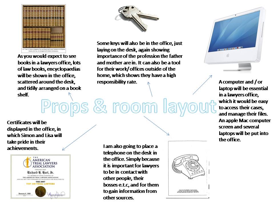
Nicola also had to think about how she wanted each of our filming locations to be presented. As we already had a living room to film in we feel we feel we didn't need to make any changes to it. As we didn't have an office we had to try and create an office from scratch. Nicola had to think about different props we could use to makke it look like an office.

The prop ideas for the office can be seen below:


Location Reccee

Nicola and Tim who is our camera man together created our location reccee. Tim took photographs of each of our locations. The living room, shed, office and garden in a panoramic view. Anton our director who wrote the script for our short film added the notes for where power sources are, the permission and lighting.

Below are the groups location reccee's:


The Storyboards

Thee storyboards was a task that the whole production group played a part in. This is because it was one of the longest and difficult tasks to complete we felt that if we split it up we can ease the flow of work. We each then took up a few scenes each to draw up. This helped us complete them much quicker.

The Storyboards can be seen below:


The Shot List


Our director Anton had the job to produce a shot list. The shot list is a very important part to our pre-production documentation. It helps us correctly know what shots we have in our short film. It is cut down from the script.

The Shot list can be seen below: